Password Sharing
MHU, or Multi Household Usage, is the internal name for Netflix’s password sharing enforcement initiative. Kids profiles were one of the last loopholes, but designing a commerce experience on kids surfaces required a delicate solution.
We can’t know the ages of members on kids profiles, so we aimed for a solution where anyone can hand off to an adult to create an account as needed: honoring the household policy, keeping commerce away from kids environments, letting parents resolve it quickly, and scaling to other commerce needs like payments.
I owned the end to end experience, the messaging and dialog system used across kids surfaces, and both hypotheses that went to testing. It launched with a $35m annual revenue win, and the enhanced dialog cell was productized.
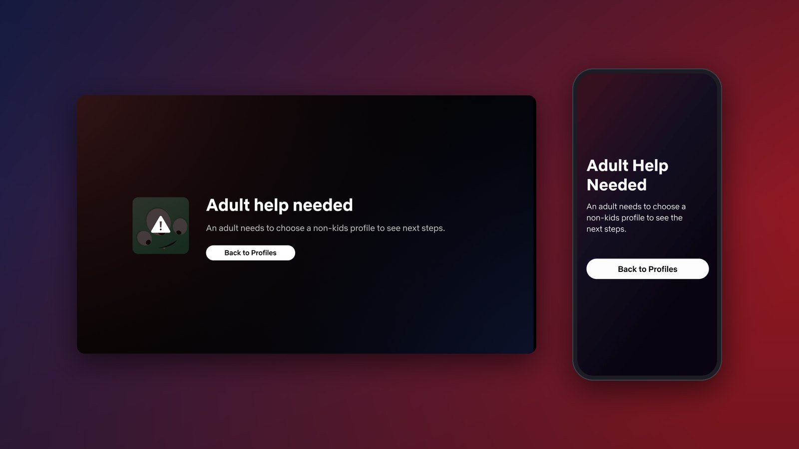
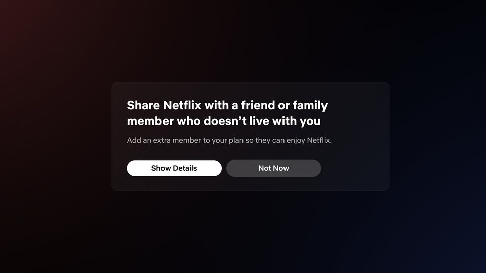
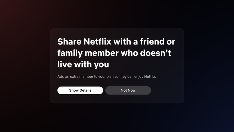
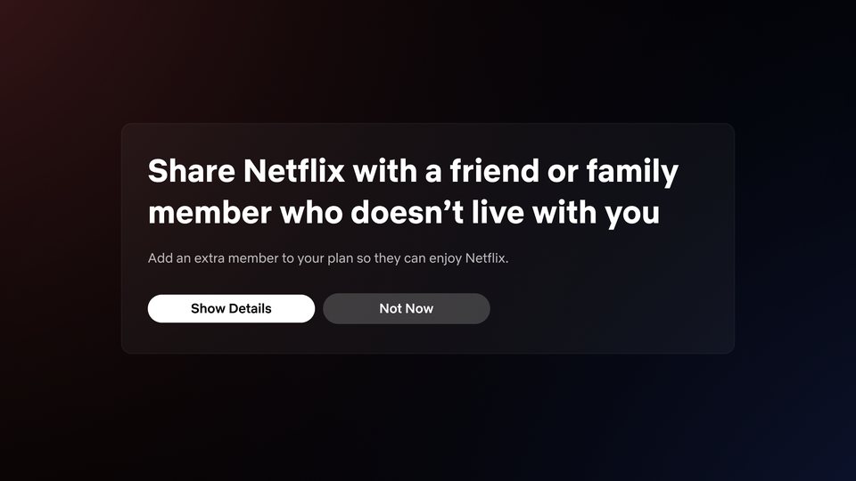
The intervention screen borrowers saw on TV, from the 2023 launch through iteration to its 2024 state.
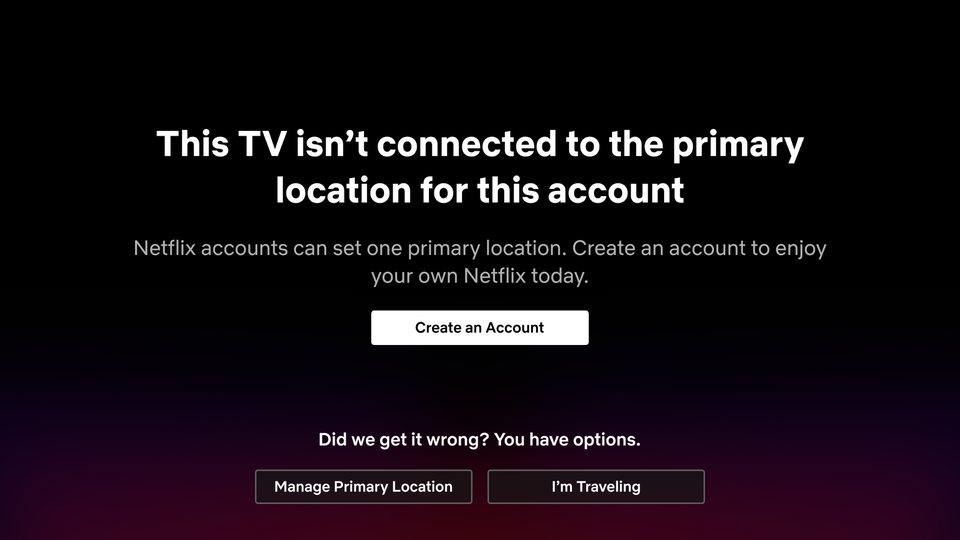
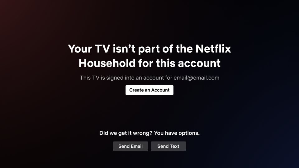
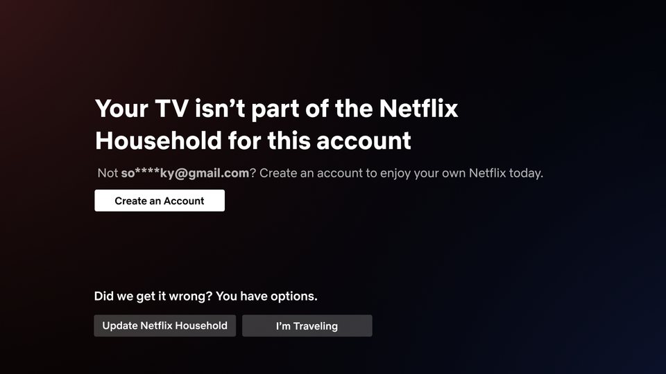
- Borrower tries to watch Netflix on a kids profile
- Hits blocking experience
- Hits enforcement
- Creates own account
- Kid tries to watch Netflix on a kids profile
- Hits blocking experience
- Hands off to an adult
- Adult hits enforcement
- Creates own account
I followed learnings from other commerce projects I led to find the right containers and hierarchy for kids profiles.
A solution that scaled to other commerce needs was a goal of the test; a one off was a non-starter. Since this messaging was aimed at kids, I set out to improve on the standard dialog.
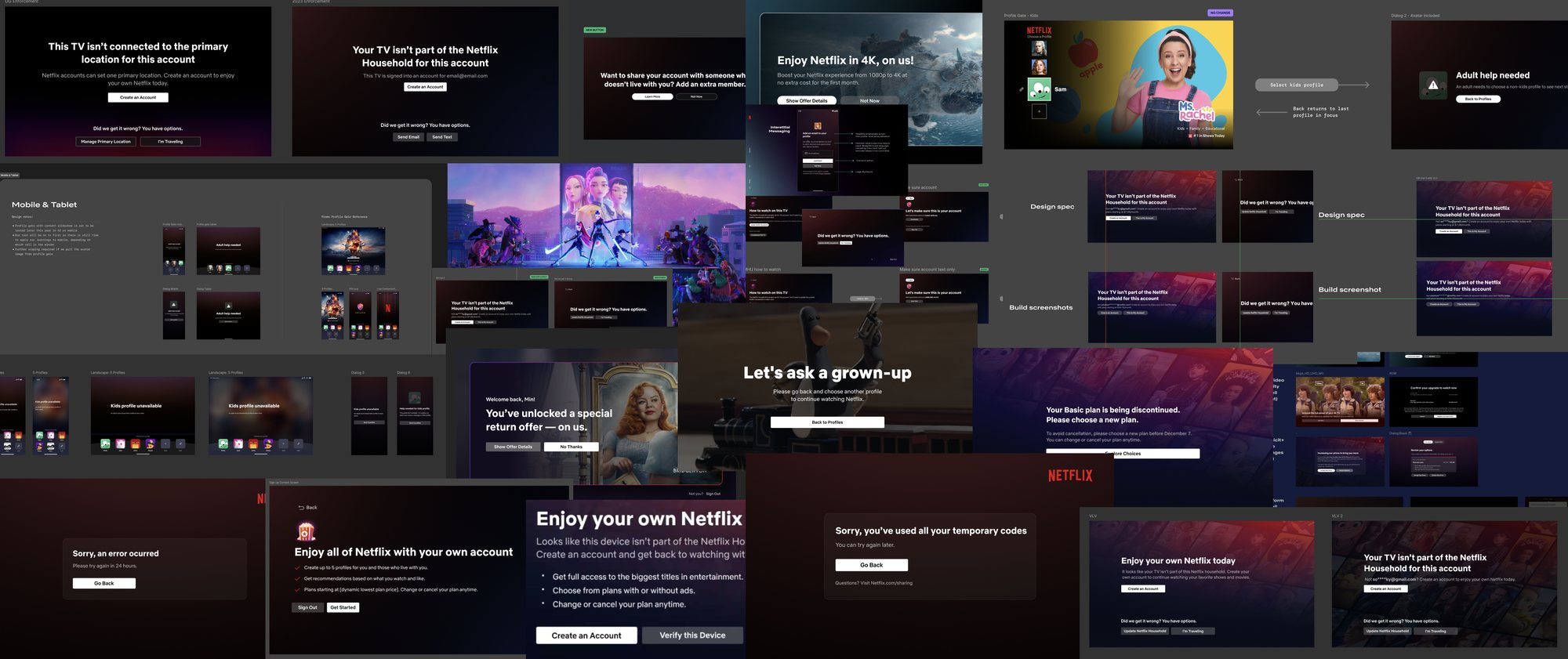
Other iterations I pushed for to evolve our borrower interventions and upsells. On TV, fewer steps and fewer choices helped grow spin off accounts and revenue.
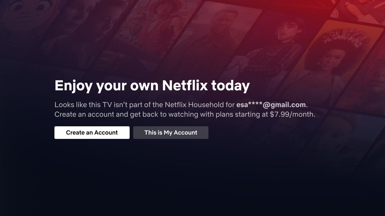
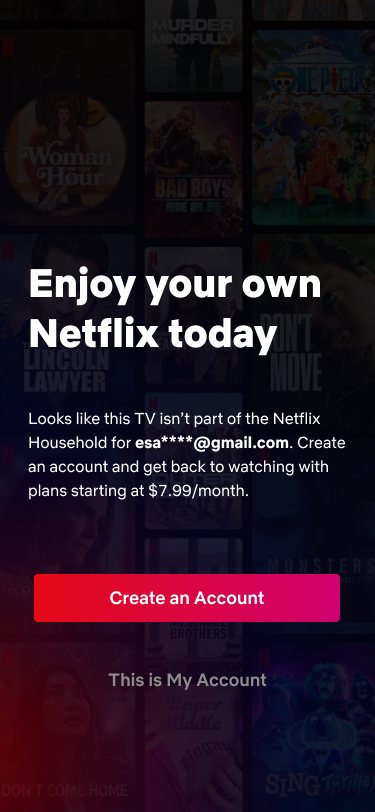


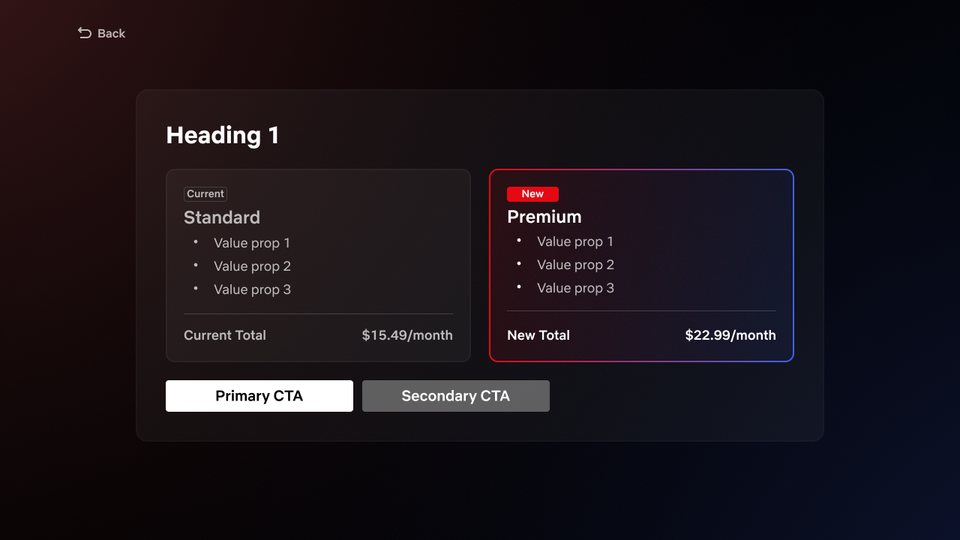
I evolved our messaging and dialog system across platforms for use cases beyond MHU, starting with TV. The aim was to make messaging as legible as possible and feel more enriched, and the swappable templates allowed for easy content tests without more design or eng work.
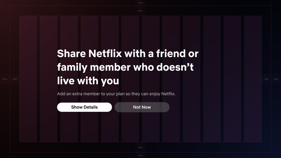

I worked with my content designer and with as many Netflix kids product experts as possible as we started to iterate.
We wanted to share our early approaches for feedback, and also gather learnings from the approaches Netflix had already taken designing on kids surfaces.
We started with a wide range of approaches, at the profile gate and as a blocking dialog, using the Netflix kids profile branding and some character driven IP.
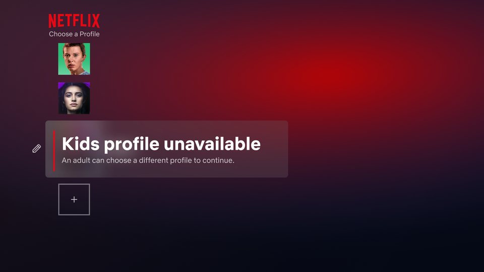
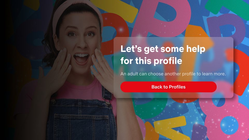
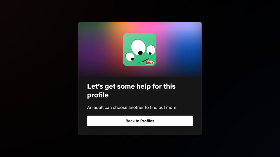
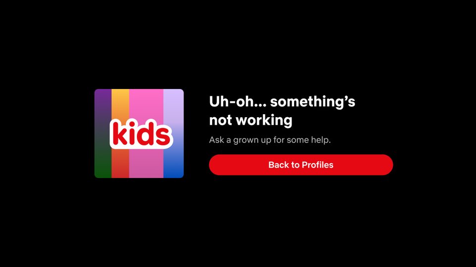
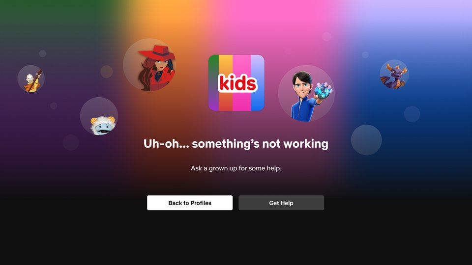
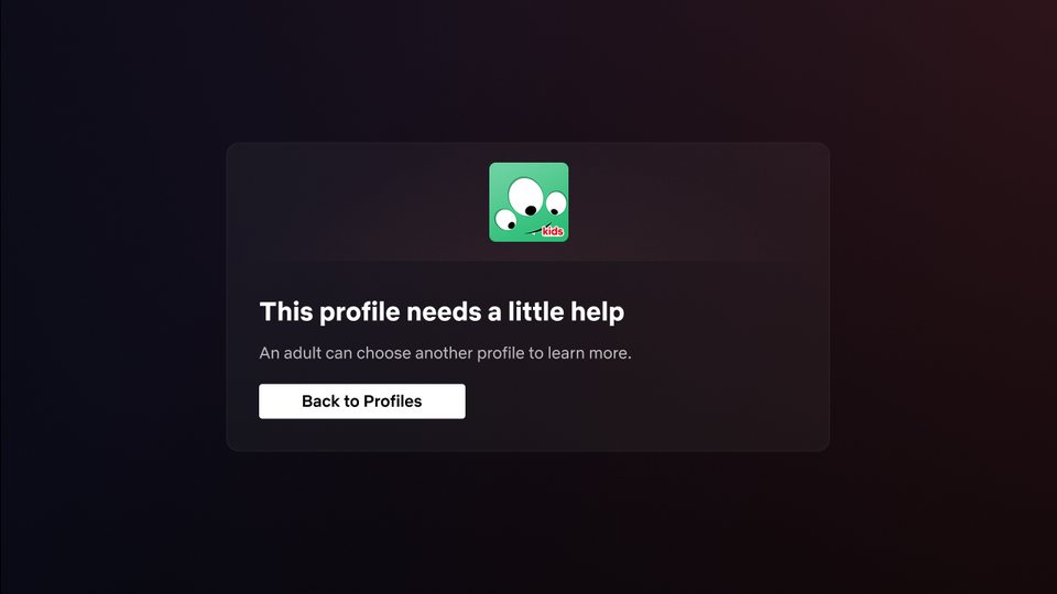
Association with characters, Netflix IP, or any content was flagged early as not ideal.
The breadth of Netflix content helps with acquisition and marketing, but for this blocking experience we wanted to be very direct that it was not associated with content.
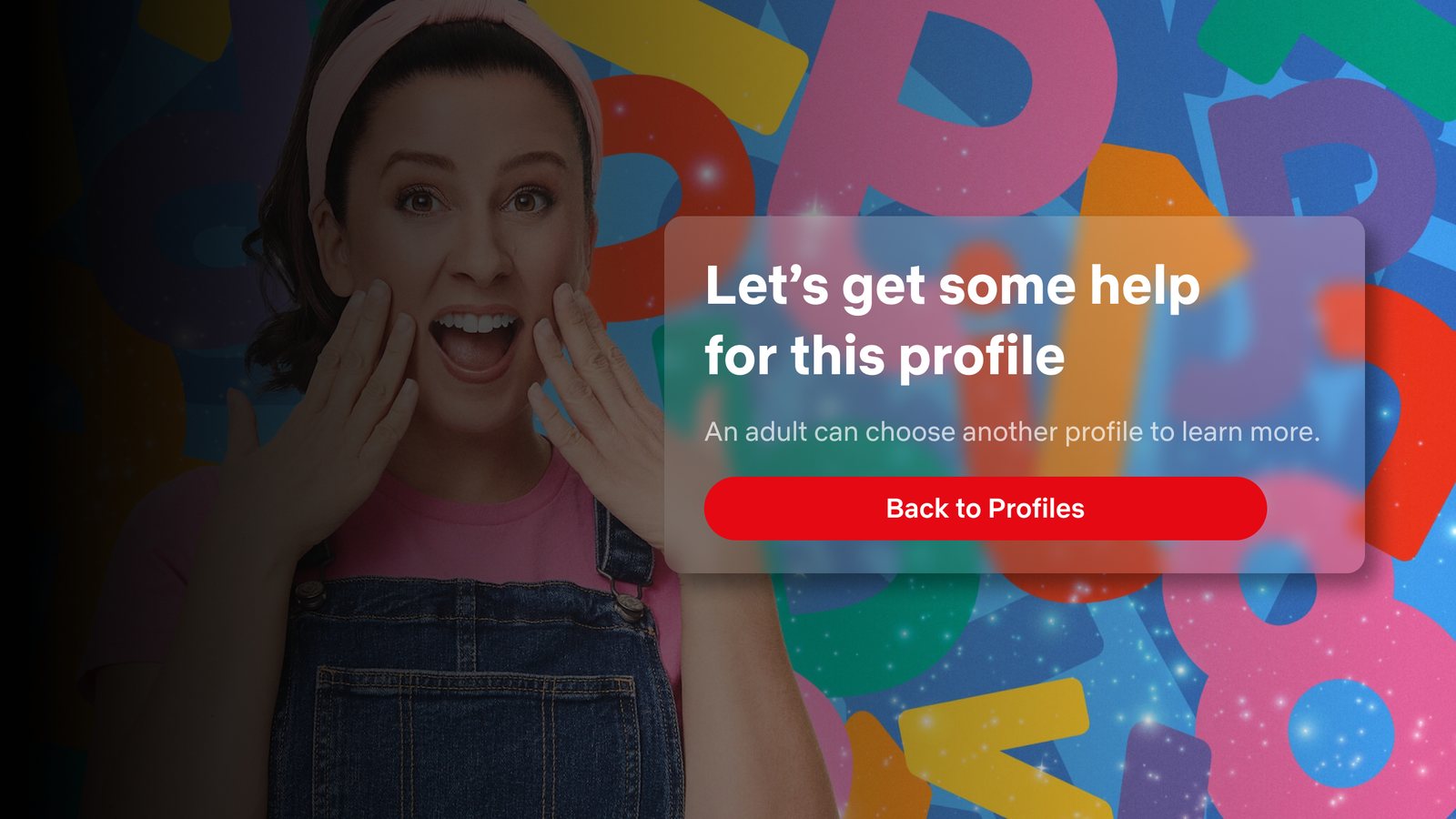
We tried voiceover as a way to reach pre-literate age groups.
Qualitative research showed younger kids had less listening comprehension than visual. The words “grown up” and a caution icon helped more than the audio assisted version.
Testing with kids and their parents, together and separately, revealed the strength of the simplest language and visuals. Resolving the issue quickly for parents, so their kids could keep watching, was the most important need.
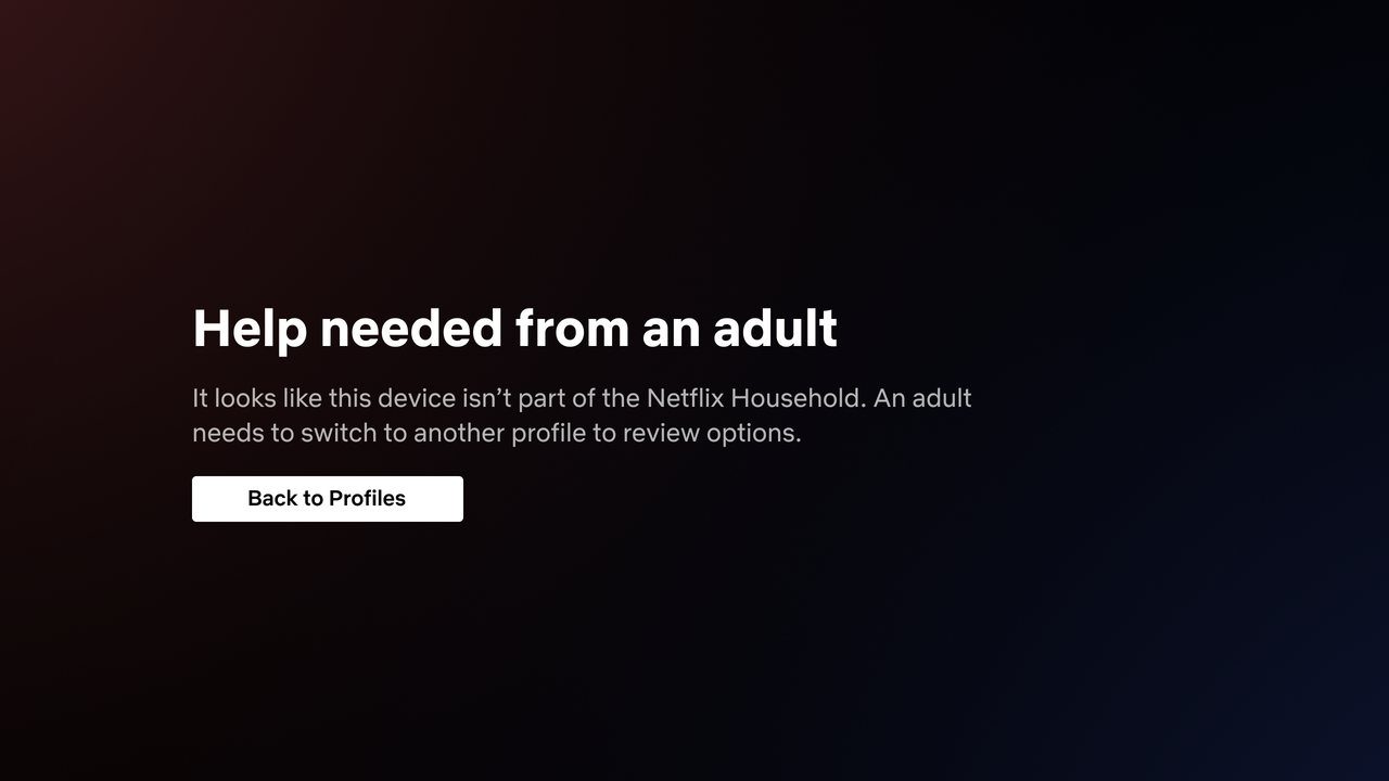
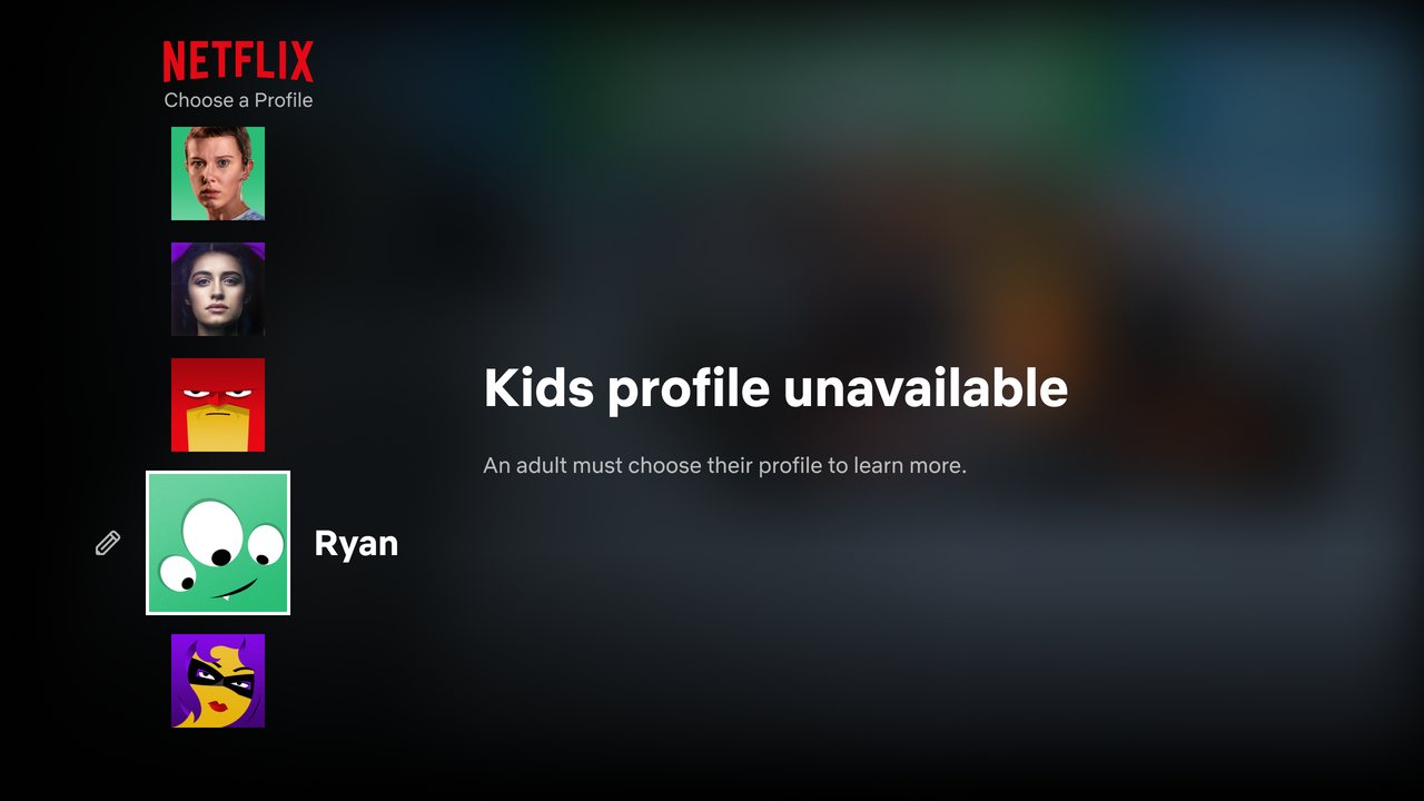
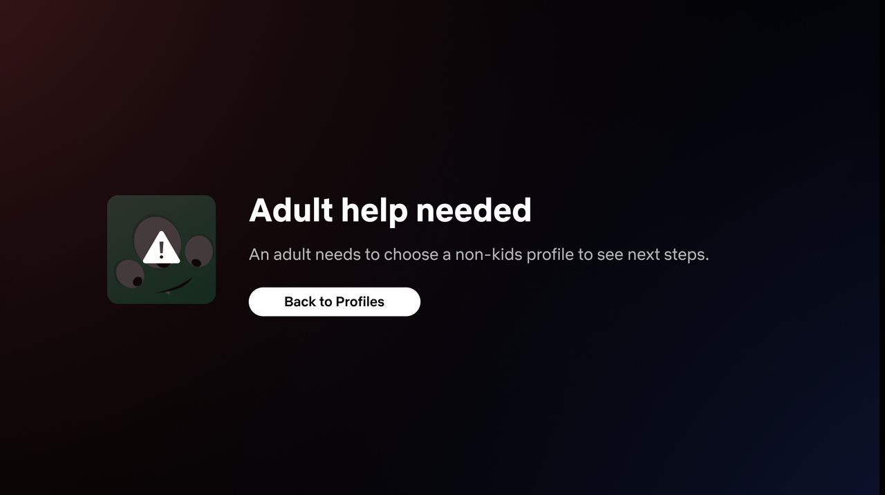
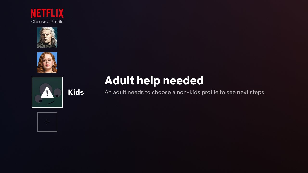
We tested our two biggest hypotheses: blocking on the profile gate, and a dialog right after it. The dialog brought a large revenue win, even though the profile gate was slightly preferred in UX testing. We shipped the cell that created more spin off accounts and revenue.
The dialog solution clearly articulated the steps needed and performed better in the test. It was productized in early 2026.
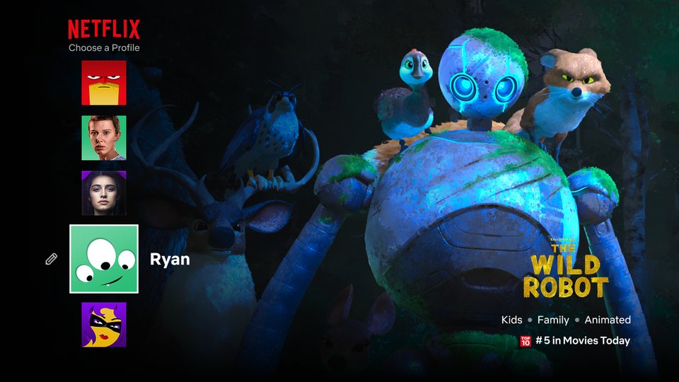
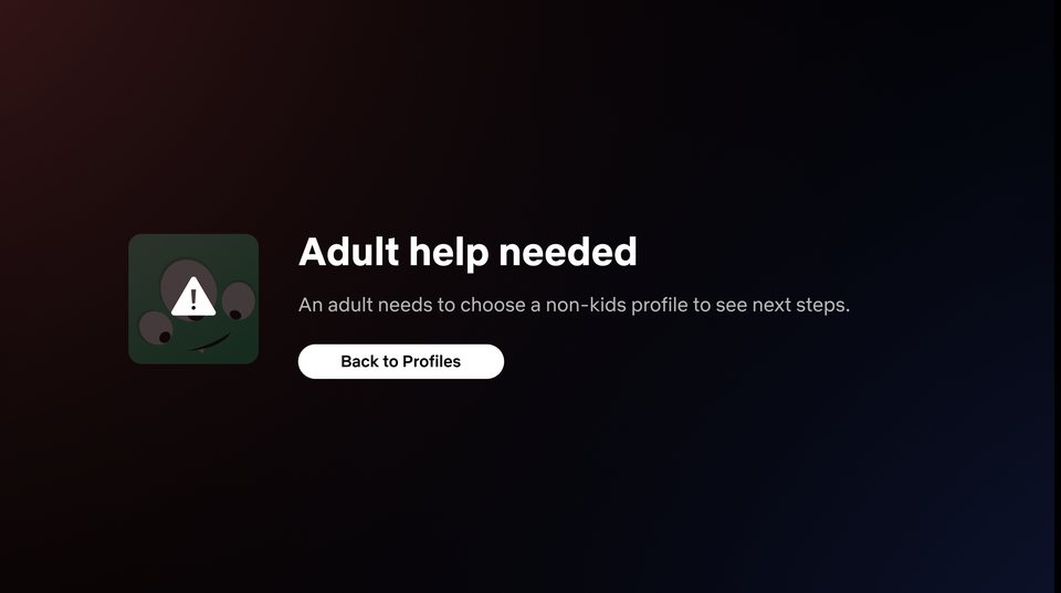
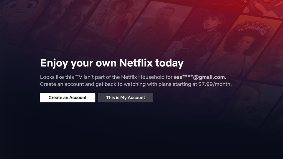
The profile gate had limited space for interventions on mobile and tablet, so the winning cell extended easily to a dialog on every platform.
Gathering previous learnings saves time
Sharing rough approaches with domain experts helped us refine faster and find what wouldn’t work.
Getting buy-in from other orgs
The profile gate solution was heavily debated since it’s a very high priority surface. We should have gone directly to the surface owners once our best proposal was ready, rather than waiting for review.
Simplicity wins again
We returned to the initial simple ideas for this project, and they closely shaped our final test cells.